The Kuk·Sool Global Alliance
Affiliated Martial Art Schools
teaching the art of Kuk·Sool
Explanation of the emblems used by The Kuk·Sool Global Alliance:
Each component will be looked at separately, with a full and complete analysis of what it means, together with pictures and/or graphics. Our alternate logo (globe), which can be viewed by clicking the logo (fist) at the top of the page, is also explained at the end.
You must orient your phone to Landscape format as the primary page content won’t display properly in Portrait mode. |
|---|
The outer border:
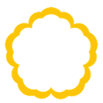
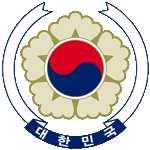
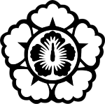
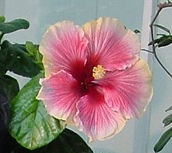
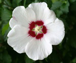
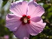
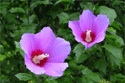
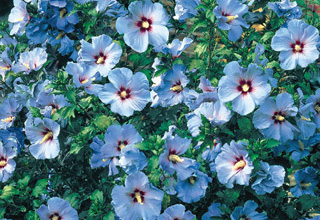
What has been described as a “cloud-like perimeter” in regards to similar martial art logos, is actually a crude representation of the national flower of South Korea, the Rose of Sharon or Mu·Goong·Hwa [무궁화] – “Eternal Flower” (scientific name: Hibiscus Syriacus). The Rose of Sharon is a deciduous flowering shrub, seen most commonly with pink flowers but other colors do exist, including a pale blue variety which still retains the reddish center and the yellow pistil/stamen cluster (thus representing the 3 primary colors, discussed below). While the actual flower does have 5 petals, they are not necessarily trifurcated, i.e. possesing 3 distinct sections. But our cinquefoil border does have trifurcated lobes, as the numbers 3 & 5 are important to Asian philosophy (also discussed below). We use gold for the color of the border as it signifies nobility in many cultures as well as that of Korea.
 |  |  |
  |
  |  |
| Our flower border | South Korean coat-of-arms | Emblem of ROK Prime Minister |
A few photos of Mu Goong Hwa. | The blue variety of this flower. | |
|---|---|---|---|---|---|
The tri-colored disc, or Sam-Saegui Taegeuk:
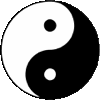
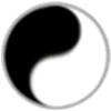
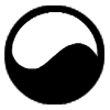
The Sam-Saegui Taegeuk [삼색의 태극] is a symbol steeped in Korean tradition, relying on the three primary colors swirled together to occupy equal portions within a circle. This symbol depicts a host of complex, yet fundamental principles (e.g. unity, completeness, harmony, etc.) and rather than give a long list of philosphical explanations, perhaps the best way to describe it is by contrasting it with the more familiar idea seen in China, epitomized by the yin-yang symbol (the blending of yin/yang is called “Tai Chi” [tàijí ; 太極] in Chinese and “Tae Geuk” in Korean, often translated as “grand ultimate” or “great polarity/duality”). Note that the Chinese yin-yang typically has two smaller circles inside each teardrop-shaped half of the entire circle. While most people are aware of the imbued dualism evident in the two differently colored sections (usually shown as black & white, although the Korean variant uses red & blue), not everyone realizes that the smaller circles represent the flux between the two opposing forces, as well as the harmony that results from such flow. Rather than using small circles contained within each portion, Koreans utilize the 3 primary colors to designate the 2 opposing forces in nature (um/yang: 음양), as well as the balance needed for both to successfully coexist. Numerous “trinities” abound, such as Yu·Won·Hwa [유원화], that are also pertinent to martial art concepts.
 |  | 
|
 | 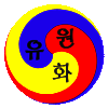 | |
| Sam-Saegui Taegeuk | Standard Yin-Yang | simple Yin-Yang (but moving) | Tae-Geuk Gi (click it for more info) | older versions of the ROK flag | Yu•Won•Hwa |
|---|
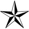
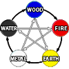
The five-pointed star:
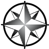
Whereas the circle of the Sam-Saegui Taegeuk, with its soft arcing lines, represents the concept of fluidity, the star depicts the concept of angles, which is also prevalent in the martial art of Kuk·Sool. Additionally, the star is shown in black & white (actually, transparent & black – to better reveal the tricolored disc), which harkens back to the um/yang mentioned above. The number 5 has already been honored with the lobes of the border, but the star helps to magnify its importance with regard to Five Element Theory and other pentad centric ideologies (note: our emblem is comprised of exactly 5 items). In fact, despite compass directions guiding a martial artist's movement, viewing one's environment is typically done in five sections:
1) directly in front, 2) & 3) peripheral vision to either side, and 4) & 5) looking behind, depending on which way you turn your head.
 |  |  |  | 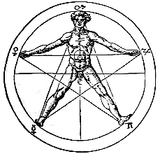 | ||
| clear star | B/W star | clear um-yang | B/W um-yang | Five Phase Theory | standard compass layout | 5 appendages of the body |
|---|
To better view the transparency in this set of images, click this button >>>
The fist & banner:
The fist is a common symbol of many martial fraternities and military organizations. While most martial art logos with fists depict it as if you are being punched by the fist, our fist & banner is very similar to the entire logo used for Goju-Ryu Karate, which has an upright view of the fist. The Strategic Air Command emblem makes use of a similar view, with an armored fist clutching an olive branch and lightning bolts. More details about the banner can be found below.
 | 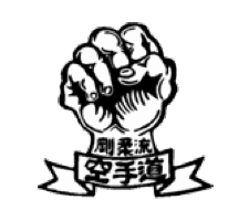 |
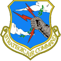 | 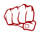 |
| Our fist | Goju-Ryu fist | SAC shield insignia | typical martial art fist graphic (head-on view) |
|---|
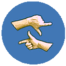
The ribbon/banner:
The banner looks like many others typically used in heraldic devices, but notice that unlike the Goju-Ryu ribbon, the swallowtailed ends aren't even. This is because they represent the extended thumb & forefinger, an important facet of many joint-locking techniques as well as certain sword gripping techniques. Since Kuk·Sool was strongly influenced by Hapkido and this hand position is prevalent in the Hapkido arts, it helps to explain why the Kido-Hae (an early non-Taekwondo, Korean martial art organization) also displays this concept in its logo. The boomerang-shaped wedges (also described as sideways chevrons or perhaps skewed arrowheads) in the Kido-Hae logo not only serve as being angular versions of the teardrop-shaped portions of the um/yang symbol, but also exhibit the same unevenness in their tips or ends which are present in our banner, and as already stated, this alludes to the extended thumb & forefinger. Also interesting to note, is when making fists with the thumb and index finger extended (i.e. Ki-power hands) and placing both thumbs adjacent to one another so that the index fingers point in opposite directions, one hand is pronated while the other is supinated, i.e. um & yang.
 | 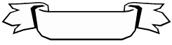 | 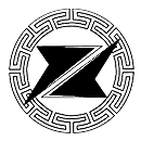 | 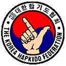 |  |  |
| Our ribbon/banner | a common heraldic ribbon (“tongues” added to its swallowtailed ends) | Kido-Hae logo | symbol of The Korea Hapkido Federation | Jung Sool Kwan | KI-Power hands |
|---|
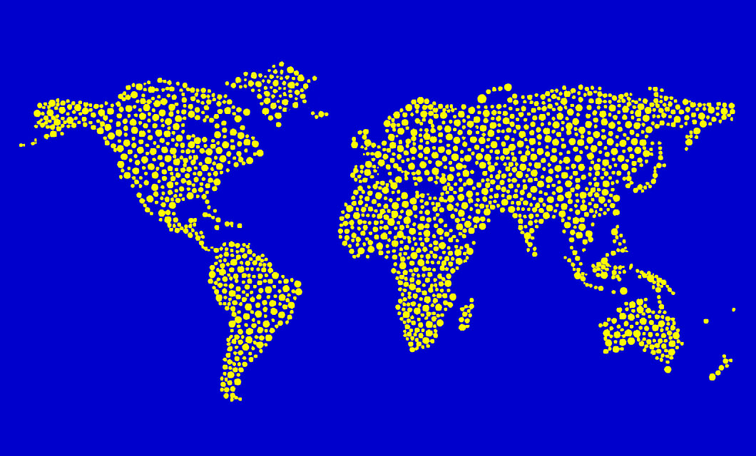
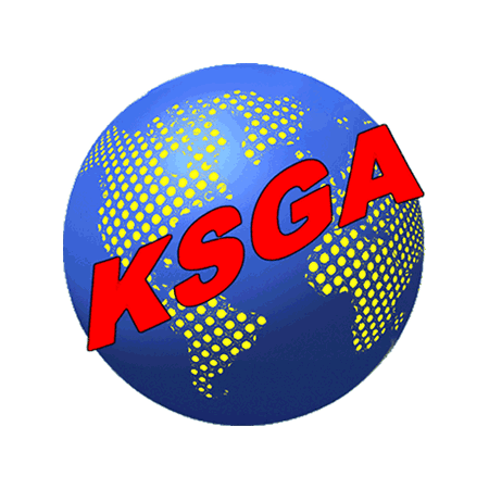
Our globe logo utilizes the 3 primary colors evident in the Sam Saegui Taegeuk symbol (tri-colored disc), using blue for the oceans, yellow dots for the continents (the dots signify the individuals which constitute the alliance), and red for the letters 'KSGA' which are obviously the initials for Kuk·Sool Global Alliance, also found spelled out in full using plain black lettering to encircle the globe. Click the FIST logo at the top of this page to view the GLOBE logo.
This concludes the explanation of our original emblem as well as our globe logo. We hope you found it interesting.
Take charge of your martial art business and build a better future that you can depend on!
Come join us, especially if you feel the time is right
 To enroll in the Alliance,
click heretap here, or on the spinning globe to the right.
To enroll in the Alliance,
click heretap here, or on the spinning globe to the right.


Today is: